class: center, middle, inverse, title-slide # <span style="color:#fcab27">Beautiful graphics in <code>ggplot2</code></span> ### <a href = 'https://twitter.com/thomas_mock'><span style="color:#ff2b4f">Tom Mock</span></a> ### 2021-05-20 --- <style type="text/css"> .large { font-size: 150% } </style> ### Why `ggplot2`? Per [John Burn Murdoch of the FT](https://johnburnmurdoch.github.io/slides/r-ggplot/#/35): > `ggplot2` is awesome because: > - It takes minimal time and effort to audition multiple different ideas for a graphic, and to iterate on them > - It gets people thinking in the continuous visual encoding space, rather than the discrete chart-type space ### Breaking that down * `ggplot2` (and R) is fantastic for exploratory data analysis * `ggplot2` is an application of the "Grammar of Graphics", rather than a "make this chart" tool --- ### A **grammar** of graphics -- Images from John-Burn Murdoch's presentation: [**ggplot2 as a creativity engine**](https://johnburnmurdoch.github.io/slides/r-ggplot/#/) .pull-left[ Easy enough to [*rapidly prototype*](https://johnburnmurdoch.github.io/slides/r-ggplot/#/14) graphics at the "speed of thought" 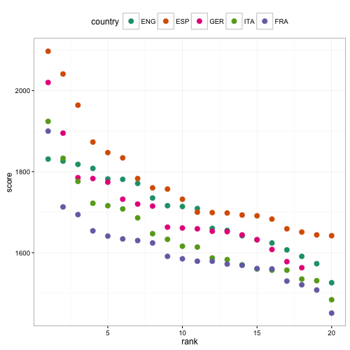<!-- --> ] -- .pull-right[ Powerful enough for [*final "publication"*](https://johnburnmurdoch.github.io/slides/r-ggplot/#/34) <img src="http://blogs.ft.com/ftdata/files/2016/03/eng.png" width="75%" /> ] --- ### BBC's `ggplot2` cookbook 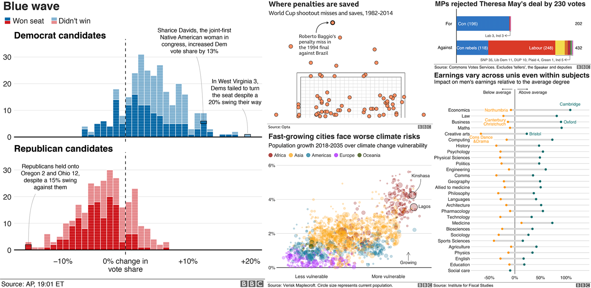 --- class: inverse, middle, center # Coding time! --- ## Data Prep A few datasets to start us off ```r diff_df <- readr::read_csv("https://raw.githubusercontent.com/jthomasmock/radix_themockup/master/static/diff_df.csv") combo_pass <- readr::read_csv("https://raw.githubusercontent.com/jthomasmock/radix_themockup/master/static/combo_pass.csv") ``` ```r glimpse(diff_df) ``` ``` ## Rows: 224 ## Columns: 7 ## $ year <dbl> 2014, 2014, 2014, 2014, 2014, 2014, 2014, 2014, 2014, 201… ## $ conf <chr> "AFC", "AFC", "AFC", "AFC", "AFC", "AFC", "AFC", "AFC", "… ## $ team_name <chr> "Patriots", "Broncos", "Steelers", "Colts", "Bengals", "R… ## $ abb_name <chr> "NE", "DEN", "PIT", "IND", "CIN", "BAL", "KC", "HOU", "SD… ## $ logos <chr> "https://a.espncdn.com/i/teamlogos/nfl/500/scoreboard/ne.… ## $ win_percent <dbl> 0.75000, 0.75000, 0.68750, 0.68750, 0.65625, 0.62500, 0.5… ## $ differential <dbl> 155, 128, 68, 89, 21, 107, 72, 65, 0, 54, 15, -38, -118, … ``` --- ### Back to basics ```r basic_plot <- ggplot(diff_df, aes(x = differential, y = win_percent)) + geom_point() basic_plot ``` <img src="intro-plot_files/figure-html/unnamed-chunk-6-1.png" width="432" /> --- ### Built in themes ```r basic_plot + theme_minimal() ``` <img src="intro-plot_files/figure-html/unnamed-chunk-7-1.png" width="432" /> --- ### Built in themes ```r basic_plot + theme_bw() ``` <img src="intro-plot_files/figure-html/unnamed-chunk-8-1.png" width="432" /> --- ### `ggthemes` themes ```r basic_plot + ggthemes::theme_fivethirtyeight() ``` <img src="intro-plot_files/figure-html/unnamed-chunk-9-1.png" width="432" /> --- ### `ggthemes` themes ```r basic_plot + ggthemes::theme_economist() ``` <img src="intro-plot_files/figure-html/unnamed-chunk-10-1.png" width="432" /> --- ### Manual theme ```r basic_plot + theme( panel.grid.major = element_line(color = "red"), axis.text.x = element_text(size = 20, color = "red"), plot.background = element_rect(fill = "lightblue"), panel.background = element_rect(fill = "blue") ) ``` <img src="intro-plot_files/figure-html/unnamed-chunk-11-1.png" width="432" /> --- ### `theme()` elements For the theme elements, there are: * `element_line()` - change line element components, takes arguments like color, size, linetype (dotted, dashed, solid, etc) * `element_rect()` - change rectangular components like plot backgrounds, legend backgrounds, etc, takes arguments like fill, color, size * `element_text()` - change text components like axis labels, titles, and takes arguments like family (font family), face (bold, italics, etc), hjust/vjust (horizontal or vertical alignment), color, etc * `element_blank()` - completely remove an element by name * `margin()` - adjust margins of an element, can be used within some other theme componenets, and takes arguments of t (top), r (right), b (bottom), l (left), and unit (unit such as points, in, cm, etc) * `rel()` - relative sizing of elements, useful for text especially, ie choosing a base font size and scaling the titles vs body fonts relative to each other --- class: inverse, middle, center # Inspiration --- ### ["Steal like an artist"](https://austinkleon.com/steal/) > Your job is to collect good ideas. The more good ideas you collect, the more you can choose from to be influenced by. .pull-left[ * [FiveThirtyEight](https://fivethirtyeight.com/features/the-56-best-and-weirdest-charts-we-made-in-2019/) * [NY Times Best of 2020](https://www.nytimes.com/2020/06/10/learning/over-60-new-york-times-graphs-for-students-to-analyze.html) * [Storytelling with Data challenges](http://www.storytellingwithdata.com/blog/2018/6/19/june-swdchallenge-recap-slopegraphs) * [`#TidyTuesday` meta-collection, thanks to Dr. Silvia Canelón](https://www.notion.so/Data-Viz-Bookmarks-dc01718020bd4fd6a8a4ca80e6bce933) ] .pull-right[ 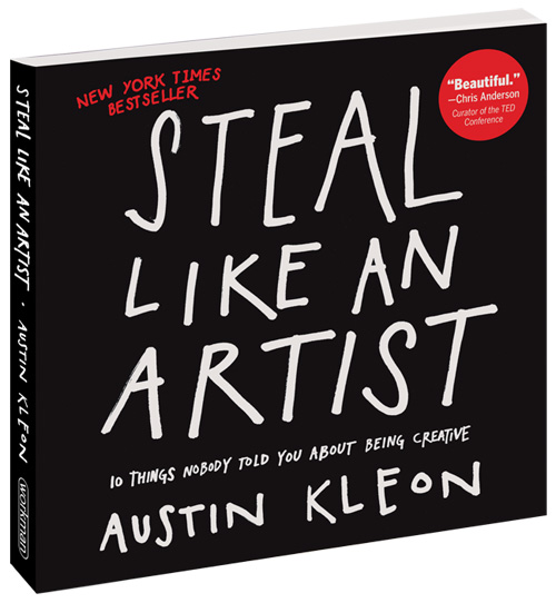 ] --- ### A personal favorite I love FiveThirtyEight's graphics and tables, as such we'll try to recreate some of their graphics. We're going to "steal like an artist" -- ### Key elements * Focus on Web, ie relatively small graphics * Light smoke-grey background with grey gridlines * Black Plot Titles/Subtitles and Axis Labels * Grey axis text (ie numbers on axis) * LARGE plot titles and axis labels, with medium subtitles and axis text * Opinionated fonts * Always add a source * Bright, high-contrast colors for plots --- ### FiveThirtyEight <img src="https://fivethirtyeight.com/wp-content/uploads/2019/04/roeder-jeopary-folo-2.png" width="75%" /> --- ### More FiveThirtyEight .pull-left[  ] .pull-right[  ] --- ### Create your own theme ```r theme_538 <- function(base_size = 12, base_family = "Chivo") { theme_grey(base_size = base_size, base_family = base_family) %+replace% theme( # drop minor gridlines and axis-ticks panel.grid.minor = element_blank(), axis.ticks = element_blank(), # change font elements/family text = element_text(family = "Chivo", size = base_size), axis.text = element_text(face = "bold", color = "grey", size = base_size), axis.title = element_text(face = "bold", size = rel(1.33)), axis.title.x = element_text(margin = margin(0.5, 0, 0, 0, unit = "cm")), axis.title.y = element_text(margin = margin(0, 0.5, 0, 0, unit = "cm"), angle =90), plot.title = element_text(face = "bold", size = rel(1.67), hjust = 0), plot.title.position = "plot", plot.subtitle = element_text(size = 16, margin = margin(0.2, 0, 1, 0, unit = "cm"), hjust = 0), plot.caption = element_text(size = 10, margin = margin(1, 0, 0, 0, unit = "cm"), hjust = 1), # change plot colors for the background/panel elements plot.background = element_rect(fill = "#f0f0f0", color = NA), panel.background = element_rect(fill = "#f0f0f0", color = NA), panel.grid.major = element_line(color = "#d0d0d0"), panel.border = element_blank(), # shrinks margin and simplify the strip/facet elements plot.margin = margin(0.5, 1, 0.5, 1, unit = "cm"), strip.background = element_blank(), strip.text = element_text(size = rel(1.33), face = "bold") ) } ``` --- # A dataviz journey ```r nfl_stand <- 2014:2020 %>% map_dfr(espnscrapeR::get_nfl_standings) ``` ```r nfl_stand_plot <- nfl_stand %>% ggplot(aes(x = pts_diff, y = win_pct)) + geom_point() + geom_smooth(method = "lm") nfl_stand_plot ``` ``` ## `geom_smooth()` using formula 'y ~ x' ``` <img src="intro-plot_files/figure-html/unnamed-chunk-16-1.png" width="432" /> --- ### Color by playoffs ```r nfl_stand_prep <- nfl_stand %>% mutate( color = case_when( season < 2020 & seed <= 6 ~ "blue", season == 2020 & seed <= 7 ~ "blue", TRUE ~ "red" ) ) ``` ```r nfl_stand_prep ``` ``` ## # A tibble: 224 x 29 ## conf season team_id team_location team_name team_abb team_full team_logo ## <chr> <dbl> <dbl> <chr> <chr> <chr> <chr> <chr> ## 1 AFC 2014 17 New England Patriots NE New Engla… https://a.e… ## 2 AFC 2014 7 Denver Broncos DEN Denver Br… https://a.e… ## 3 AFC 2014 23 Pittsburgh Steelers PIT Pittsburg… https://a.e… ## 4 AFC 2014 11 Indianapolis Colts IND Indianapo… https://a.e… ## 5 AFC 2014 4 Cincinnati Bengals CIN Cincinnat… https://a.e… ## 6 AFC 2014 33 Baltimore Ravens BAL Baltimore… https://a.e… ## 7 AFC 2014 12 Kansas City Chiefs KC Kansas Ci… https://a.e… ## 8 AFC 2014 34 Houston Texans HOU Houston T… https://a.e… ## 9 AFC 2014 24 San Diego Chargers SD San Diego… https://a.e… ## 10 AFC 2014 2 Buffalo Bills BUF Buffalo B… https://a.e… ## # … with 214 more rows, and 21 more variables: seed <dbl>, wins <dbl>, ## # losses <dbl>, win_pct <dbl>, g_behind <dbl>, ties <dbl>, pts_for <dbl>, ## # pts_against <dbl>, pts_diff <dbl>, streak <dbl>, div_ties <dbl>, ## # record <chr>, home_wins <dbl>, home_losses <dbl>, away_wins <dbl>, ## # away_losses <dbl>, conf_wins <dbl>, conf_losses <dbl>, div_wins <dbl>, ## # div_losses <dbl>, color <chr> ``` --- ### Color by playoffs ```r nfl_stand_prep %>% ggplot(aes(x = pts_diff, y = win_pct)) + geom_vline(xintercept = 0, size = 0.75, color = "#737373") + geom_point(aes(color = I(color))) ``` <img src="intro-plot_files/figure-html/unnamed-chunk-19-1.png" width="432" /> --- ### Add text ```r nfl_stand_prep %>% ggplot(aes(x = pts_diff, y = win_pct)) + geom_vline(xintercept = 0, size = 0.75, color = "#737373") + geom_point( aes(color = I(color)), size = 3, alpha = 0.8 ) + labs(x = "Points Differential", y = "Win Percent", title = "Playoff teams typically have a positive point differential", subtitle = "Data through week 17 of the 2020 NFL Season", caption = "Plot: @thomas_mock | Data: ESPN") ``` --- ### Add text <img src="intro-plot_files/figure-html/textPlot-1.png" width="432" /> --- ### Refine labels First create a helper dataset, we'll use it for annotations later. ```r library(ggtext) # create a tiny dataset playoff_label_scatter <- tibble( differential = c(25,-70), y = c(0.3, 0.8), label = c("Missed<br>Playoffs", "Made<br>Playoffs"), color = c("#D50A0A", "#013369") ) nfl_stand_refine <- nfl_stand %>% mutate( color = case_when( season < 2020 & seed <= 6 ~ "#013369", season == 2020 & seed <= 7 ~ "#013369", TRUE ~ "#D50A0A" ) ) ``` --- ### Refine labels ```r playoff_diff_plot <- nfl_stand_refine %>% ggplot(aes(x = pts_diff, y = win_pct)) + geom_vline(xintercept = 0, size = 0.75, color = "#737373") + geom_hline(yintercept = 0, size = 0.75, color = "#737373") + geom_point( aes(color = I(color)), size = 3, alpha = 0.8 ) + ggtext::geom_richtext( data = playoff_label_scatter, aes(x = differential, y = y, label = label, color = I(color)), fill = "#f0f0f0", label.color = NA, # remove background and outline label.padding = grid::unit(rep(0, 4), "pt"), # remove padding family = "Chivo", hjust = 0.1, fontface = "bold", size = 8 ) + labs(x = "Points Differential", y = "Win Percent", title = "Playoff teams typically have a positive point differential", subtitle = "Data through week 17 of the 2020 NFL Season", caption = str_to_upper("Plot: @thomas_mock | Data: ESPN")) + scale_y_continuous( labels = scales::percent_format(accuracy = 1), breaks = seq(.0, 1, by = .20) ) + scale_x_continuous( breaks = seq(-200, 250, by = 50) ) + theme_538() playoff_diff_plot # plot_play <- playoff_diff_plot + # ggthemes::theme_fivethirtyeight() # ggsave(filename = "ex-plot.png", plot = plot_play, dpi = "retina", height = 6, width = 9.7) ``` --- ### Refine labels <img src="intro-plot_files/figure-html/refineLabels-1.png" width="864" /> --- ### Same data, different story ```r library(ggridges) stand_density <- nfl_stand %>% mutate( color = case_when( season < 2020 & seed <= 6 ~ "#013369", season == 2020 & seed <= 7 ~ "#013369", TRUE ~ "#D50A0A" ) ) %>% ggplot(aes(x = pts_diff, y = factor(season), color = I(color), fill = I(color))) + geom_vline(xintercept = 0.5, size = 0.75, color = "#737373") + geom_density_ridges(alpha = 0.8, scale = 0.9) + theme_538() ``` --- ### Same data, different story <img src="images/dens-plot.png" height="500" /> --- ### Same data, different story ```r # create a small dataset for the custom annotations playoff_label_ridge <- tibble( y = c(7.55, 7.55), differential = c(-250,175), label = c("Missed<br>Playoffs", "Made<br>Playoffs"), color = c("#D50A0A", "#013369") ) stand_density + scale_x_continuous(breaks = scales::pretty_breaks(n = 10)) + coord_cartesian(xlim = c(-250, 250)) + ggtext::geom_richtext( data = playoff_label_ridge, aes(x = differential, y = y, label = label, color = color), fill = "#f0f0f0", label.color = NA, # remove background and outline label.padding = grid::unit(rep(0, 4), "pt"), # remove padding family = "Chivo", hjust = 0 , fontface = "bold", size = 6 ) + theme_538() + theme(panel.grid.major.y = element_blank()) + labs( x = "Point Differential", y = "", title = "Playoff teams typically have a positive point differential", subtitle = "Data through week 15 of the 2020 NFL Season", caption = "Plot: @thomas_mock | Data: ESPN" ) ``` --- ### Same data, different story <img src="images/dens-plot2.png" height="500" /> --- ### Same data, yet another story ```r stand_df <- nfl_stand %>% filter(season == 2020) stand_df %>% filter(seed <= 12 & season == 2020) %>% ggplot(aes(x = tidytext::reorder_within(team_abb, seed, conf), y = pts_diff)) + geom_col() + tidytext::scale_x_reordered() + facet_grid(~conf, scales = "free_x") + geom_hline(yintercept = 0, size = 0.75, color = "#737373") + theme_538() ``` --- ### Same data, yet another story <img src="intro-plot_files/figure-html/standPlot-1.png" width="864" /> --- ### More context ```r # Small label dataset playoff_label <- tibble( seed = c(9, 2), pts_diff = c(30, 145), conf = c("AFC", "AFC"), label = c("Outside<br>looking in", "Playoff<br>teams"), color = c("#D50A0A", "#013369") ) ``` --- ### More context ```r stand_df %>% filter(seed <= 12) %>% ggplot(aes(x = as.factor(seed), y = pts_diff)) + geom_col( aes(fill = if_else(seed <= 7, "#013369", "#D50A0A")), width = 0.8 ) + ggtext::geom_richtext( data = playoff_label, aes(label = label, color = I(color)), fill = "#f0f0f0", label.color = NA, # remove background and outline label.padding = grid::unit(rep(0, 4), "pt"), # remove padding family = "Chivo", hjust = 0.1, fontface = "bold", size = 6 ) + geom_hline(yintercept = 0, size = 0.75, color = "#737373") + geom_vline(xintercept = 7.5, size = 1, color = "grey") + geom_vline(xintercept = 0.5, size = 0.75, color = "#737373") + facet_grid(~conf, scales = "free_x") + scale_y_continuous(breaks = scales::pretty_breaks(n = 10)) + scale_fill_identity(aesthetics = c("fill", "color")) + theme_538() + theme(panel.grid.major.x = element_blank()) + labs( x = "Playoff Seed", y = "Points Differential", title = "Playoff teams typically have a positive point differential", subtitle = "Data through week 15 of the 2020 NFL Season", caption = "Plot: @thomas_mock | Data: ESPN" ) ``` --- ### More context <img src="intro-plot_files/figure-html/moreContext-1.png" width="864" /> --- class: inverse, center, middle # A true recreation --- ### FiveThirtyEight article [The Indianapolis Colts Finally Built A Defensive Monster](https://fivethirtyeight.com/features/the-indianapolis-colts-finally-built-a-defensive-monster/) by [Ty Schalter](https://fivethirtyeight.com/contributors/ty-schalter/)  --- ### Data for recreation ```r raw_url <- "https://www.pro-football-reference.com/years/2020/opp.htm" raw_html <- read_html(raw_url) raw_table <- raw_html %>% html_table(fill = TRUE) %>% .[[2]] %>% janitor::clean_names() %>% tibble() pressure_df <- raw_table %>% select(tm, blitz_pct = bltz_percent, press_pct = prss_percent) %>% mutate(across(c(blitz_pct, press_pct), parse_number)) pass_def_raw <- raw_html %>% html_node("#all_passing") %>% html_nodes(xpath = "comment()") %>% html_text() %>% read_html() %>% html_node("table") %>% html_table() %>% janitor::clean_names() %>% tibble() pass_def_df <- pass_def_raw %>% select(tm, pass_att = att, int, pass_def = pd, sack = sk, ypa = y_a, anypa = any_a) ``` --- ### Peek at the data ```r combo_pass <- left_join( pressure_df, pass_def_df, by = "tm" ) combo_pass %>% glimpse() ``` ``` ## Rows: 32 ## Columns: 9 ## $ tm <chr> "Atlanta Falcons", "Buffalo Bills", "Carolina Panthers", "Ch… ## $ blitz_pct <dbl> 32.9, 35.8, 24.0, 21.4, 31.1, 21.3, 17.1, 39.4, 22.8, 27.9, … ## $ press_pct <dbl> 23.6, 22.2, 22.4, 22.4, 19.0, 21.9, 23.3, 25.9, 22.8, 26.2, … ## $ pass_att <dbl> 625, 573, 585, 547, 541, 585, 562, 570, 513, 567, 557, 536, … ## $ int <dbl> 12, 15, 7, 10, 11, 11, 15, 11, 10, 10, 7, 11, 3, 12, 16, 18,… ## $ pass_def <dbl> 51, 76, 58, 71, 80, 74, 78, 57, 46, 64, 51, 74, 50, 60, 64, … ## $ sack <dbl> 29, 38, 29, 35, 17, 38, 40, 48, 31, 42, 24, 41, 34, 18, 32, … ## $ ypa <dbl> 7.9, 6.9, 6.9, 7.2, 7.3, 7.2, 7.3, 6.9, 7.4, 7.2, 8.5, 7.1, … ## $ anypa <dbl> 7.4, 5.7, 6.6, 6.6, 7.2, 6.6, 6.1, 5.9, 7.1, 6.2, 8.6, 6.1, … ``` --- ### Quick plot A theme alone only gets you so far. ```r combo_pass %>% ggplot(aes(x = blitz_pct, y = press_pct)) + geom_point() + labs( x = "Blitz Rate", y = "Pressure Rate", title = "The Colts are pressuring QBs without much of a blitz", subtitle = "Blitz rate vs. pressure rate for each NFL defense, through Week 17\nof the 2020 season" ) + theme_538() ``` --- ### Quick plot <img src="intro-plot_files/figure-html/quickPlot1-1.png" width="648" /> --- ### Color and Text Prep the data, assign a color. ```r colt_df <- combo_pass %>% mutate( color = if_else(tm == "Indianapolis Colts", "#359fda", "#91c390"), fill = colorspace::lighten(color, amount = 0.3) ) %>% rowwise() %>% mutate( att_def = sum(int, pass_def, sack), cov_rate = att_def/pass_att*100 ) %>% ungroup() %>% arrange(desc(cov_rate)) label_df_cov <- tibble( label = c("Colts", "Everyone else"), color = c("#359fda", "#91c390"), fill = colorspace::lighten(color, amount = 0.3), x = c(16, 33), y = c(25, 28) ) ``` --- ### Color and Text ```r colt_df %>% ggplot(aes(x = blitz_pct, y = cov_rate, color = color, fill = fill)) + geom_point(size = 5, pch = 21) + scale_color_identity(aesthetics = c("fill", "color")) + labs( x = "Blitz Rate", y = "Pass Affected Rate", title = "The Colts affect passes at an elite rate while blitzing the least", subtitle = "Blitz rate vs. pressure rate for each NFL defense, through Week 17\nof the 2020 season", caption = "Plot: @thomas_mock | Source: PFR" ) + scale_x_continuous(limits = c(10, 45), breaks = seq(10, 45, by = 5)) + scale_y_continuous(limits = c(10, 35), breaks = seq(10, 35, by = 5)) + coord_cartesian(clip = "off") + annotate("text", x = 10, y = 10, label = "Pass affected rate = (ints + sacks + passes defended)/pass attempts", vjust = 10, hjust = 0.2, color = "darkgrey") + theme_538() ``` --- ### Color and Text <img src="intro-plot_files/figure-html/colorText1-1.png" width="648" /> --- ### Color and Text, Labeled ```r colt_df %>% ggplot(aes(x = blitz_pct, y = cov_rate, color = color, fill = fill)) + geom_point(size = 5, pch = 21) + scale_color_identity(aesthetics = c("fill", "color")) + labs( x = "Blitz Rate", y = "Pass Affected Rate", title = "The Colts affect passes at an elite rate while blitzing the least", subtitle = "Blitz rate vs. pressure rate for each NFL defense, through Week 17\nof the 2020 season", caption = "Plot: @thomas_mock | Source: PFR" ) + scale_x_continuous(limits = c(10, 45), breaks = seq(10, 45, by = 5)) + scale_y_continuous(limits = c(10, 35), breaks = seq(10, 35, by = 5)) + coord_cartesian(clip = "off") + annotate("text", x = 10, y = 10, label = "Pass affected rate = (ints + sacks + passes defended)/pass attempts", vjust = 10, hjust = 0.2, color = "darkgrey") + theme_538() + geom_label( data = label_df_cov, aes(x = x, y = y, color = color, label = label), fill = "#f0f0f0", size = 6, fontface = "bold", hjust = 0.8, label.size = NA ) ``` --- ### Color and Text, Labeled <img src="intro-plot_files/figure-html/colorLabeled-1.png" width="648" /> --- ### Back to the original  --- ### Summary * "Steal like an artist" for inspiration * Themes can make your customizations more consistent * Colors on top of that further extend the presentation * Annotations help tell a story * "Helper" datasets for annotations can speed things up * Direct labels save space and reader time --- ### Resources * [BBC Style Cookbook](https://bbc.github.io/rcookbook/#how_to_create_bbc_style_graphics) * [`ggplot2` as a creativity engine](https://johnburnmurdoch.github.io/slides/r-ggplot/#/1) * [Creating and Using custom `ggplot2` themes](https://themockup.blog/posts/2020-12-26-creating-and-using-custom-ggplot2-themes/) * [Data Viz: A Practical Introduction - K. Healy](https://socviz.co/) * [Fundamentals of Data Visualization - C. Wilke](https://clauswilke.com/dataviz/) * [`ggplot2` book, 3rd edition](https://ggplot2-book.org/index.html) * [A `ggplot2` tutorial for beautiful plotting in R](https://www.cedricscherer.com/2019/08/05/a-ggplot2-tutorial-for-beautiful-plotting-in-r/) * [`ggplot2` reference](https://ggplot2.tidyverse.org/) * [R Package Development](https://r-pkgs.org/)