Tables with R
Construct a wide variety of useful tables with a cohesive set of table parts. These include the table header, the stub, the column labels and spanner column labels, the table body and the table footer.


mtcars %>% select(cyl:wt) %>% head() %>% gt()
mtcars %>% select(cyl:wt) %>% head() %>% gt()

Basic gt table
yield_data_wide %>% gt()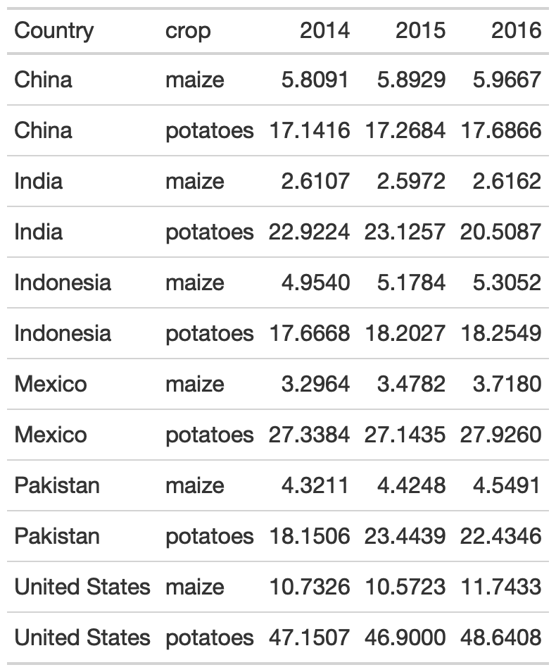
Add groups
yield_data_wide %>% head() %>% # respects grouping from dplyr group_by(Country) %>% gt(rowname_col = "crop")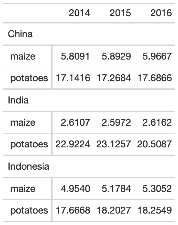
Add groups
yield_data_wide %>% head() %>% # respects grouping from dplyr group_by(Country) %>% gt(rowname_col = "crop")
yield_data_wide %>% head() %>% gt( groupname_col = "crop", rowname_col = "Country" )
Groups
yield_data_wide %>% mutate(crop = str_to_title(crop)) %>% group_by(crop) %>% gt( rowname_col = "Country" ) %>% fmt_number( columns = 2:5, # reference cols by pos decimals = 2 # decrease decimal places ) %>% summary_rows( groups = TRUE, # reference cols by name columns = c(`2014`, `2015`, `2016`), fns = list( # add summary stats avg = ~mean(.), sd = ~sd(.) ) )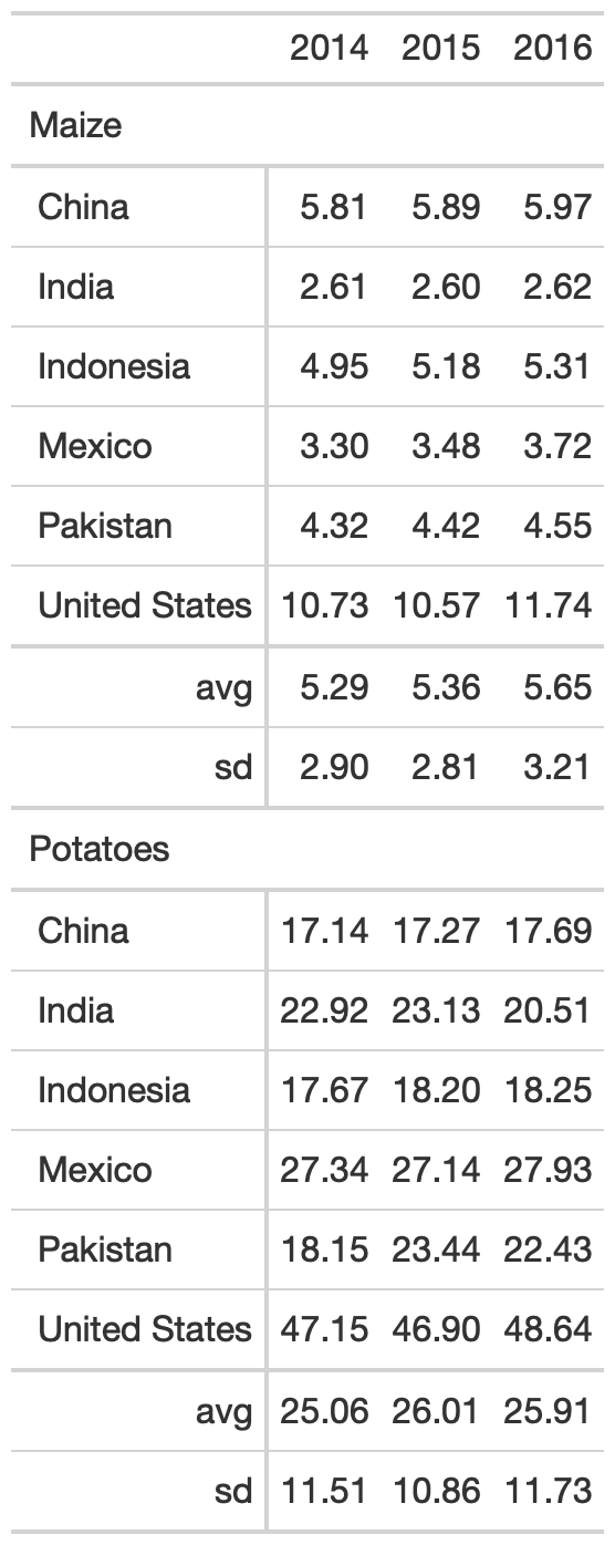
Add spanners
Table spanners can be added quickly with tab_spanner() and again use either position (column number) or with tidyeval by name.
yield_data_wide %>% head() %>% gt( groupname_col = "crop", rowname_col = "Country" ) %>% tab_spanner( label = "Yield in Tonnes/Hectare", columns = 2:5 )
Add notes and titles
Footnotes can be added with tab_footnote(). Note that this is our first use of the locations argument. Locations is used with things like cells_column_labels() or cells_body(), cells_summary() to offer very tight control of where to place certain changes.
yield_data_wide %>% head() %>% gt( groupname_col = "crop", rowname_col = "Country" ) %>% tab_footnote( footnote = "Yield in Tonnes/Hectare", locations = cells_column_labels( columns = 1:3 ) )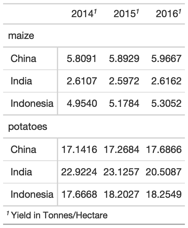
Add notes and titles
Footnotes can be added with tab_footnote(). Note that this is our first use of the locations argument. Locations is used with things like cells_column_labels() or cells_body(), cells_summary() to offer very tight control of where to place certain changes.
yield_data_wide %>% head() %>% gt( groupname_col = "crop", rowname_col = "Country" ) %>% tab_footnote( footnote = "Yield in Tonnes/Hectare", locations = cells_column_labels( columns = 1:3 # note ) ) %>% # Adding a `source_note()` tab_source_note( source_note = "Data: OurWorldInData" )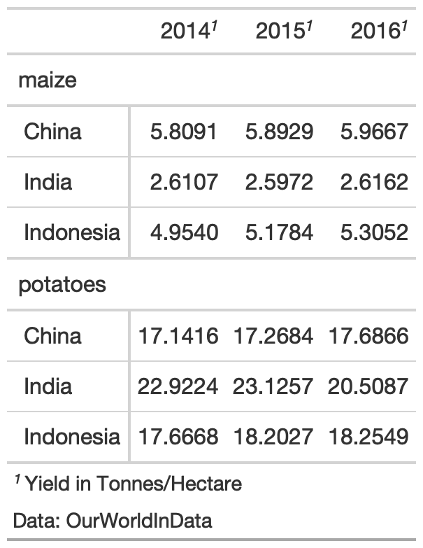
Add Title/Subtitle
Adding a title or subtitle with tab_header() and notice that I used md() around the title and html() around subtitle to adjust their appearance.
yield_data_wide %>% head() %>% gt( groupname_col = "crop", rowname_col = "Country" ) %>% tab_header( title = md("**Crop Yields between 2014 and 2016**"), subtitle = html("<em>Countries limited to Asia</em>") )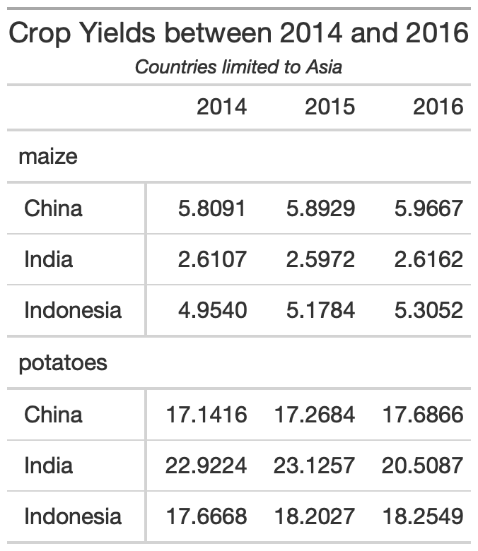
Adjust appearance
You can customize large chunks of the table appearance all at once via tab_options(). The full reference to ALL the options you can customize are in the gt packagedown site.
yield_data_wide %>% head() %>% gt( groupname_col = "crop", rowname_col = "Country" ) %>% tab_header( title = "Crop Yields between 2014 and 2016", subtitle = "Countries limited to Asia" ) %>% tab_options( heading.subtitle.font.size = 12, heading.align = "left", table.border.top.color = "red", column_labels.border.bottom.color = "red", column_labels.border.bottom.width= px(3) )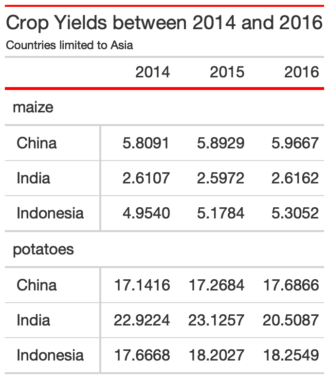
Pseudo-themes
Because gt is built up by a series of piped examples, you can also pass along additional changes/customization as a function almost like a ggplot2 theme!
my_theme <- function(data) { tab_options( data = data, heading.subtitle.font.size = 12, heading.align = "left", table.border.top.color = "red", column_labels.border.bottom.color = "red", column_labels.border.bottom.width= px(3) )}yield_data_wide %>% head() %>% gt( groupname_col = "crop", rowname_col = "Country" ) %>% tab_header( title = "Crop Yields between 2014 and 2016", subtitle = "Countries limited to Asia" ) %>% my_theme()
Style specific cells w/ tab_style()
yield_data_wide %>% head() %>% gt() %>% tab_style( style = list( cell_text(weight = "bold") ), locations = cells_column_labels(everything()) ) %>% tab_style( style = list( cell_fill(color = "black", alpha = 0.2), cell_borders( side = c("left", "right"), color = "black", weight = px(2) ) ), locations = cells_body( columns = crop ) ) %>% tab_style( style = list( cell_text(color = "red", style = "italic") ), locations = cells_body( columns = 3:5, rows = Country == "China" ) )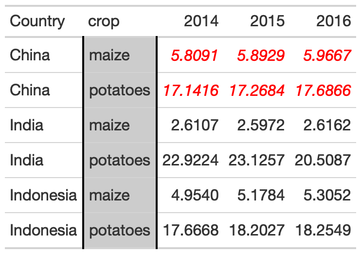
Color Gradient
my_pal <- scales::col_numeric( paletteer::paletteer_d( palette = "ggsci::red_material" ) %>% as.character(), domain = NULL )yield_data_wide %>% head() %>% gt( groupname_col = "crop", rowname_col = "Country" ) %>% data_color( columns = c(`2014`, `2015`, `2016`), colors = my_pal )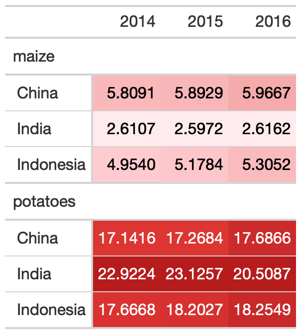
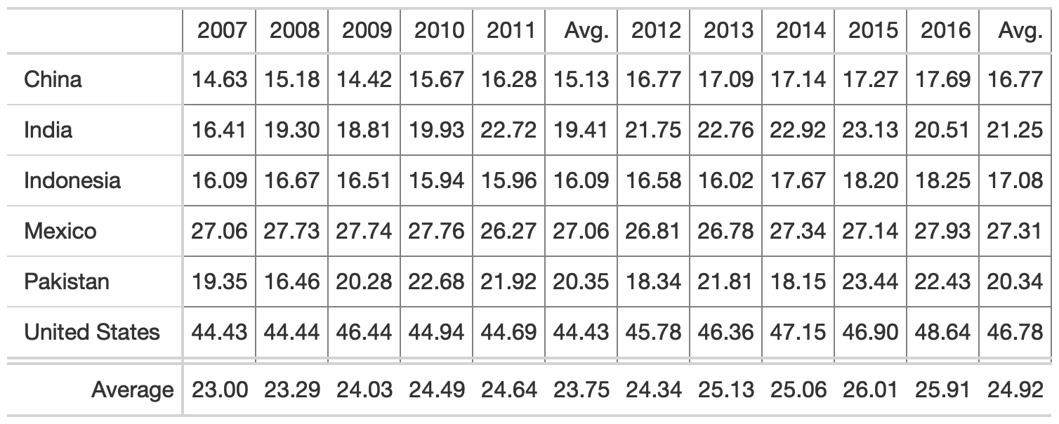
Rule 1: Offset the Heads from the Body
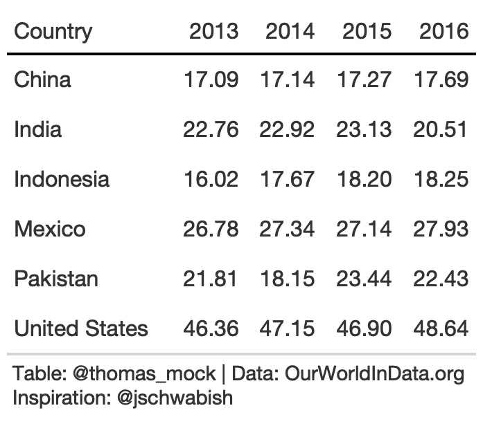
potato_tb <- potato_data %>% gt() %>% cols_hide(c(crop)) %>% opt_table_lines(extent = "none") %>% fmt_number( columns = 3:6, decimals = 2 )hot_potato <- potato_tb %>% tab_style( style = list( cell_text(weight = "bold") ), locations = cells_column_labels(everything()) ) %>% opt_table_lines(extent = "default") %>% tab_options( column_labels.border.top.color = "white", column_labels.border.top.width = px(3), column_labels.border.bottom.color = "black", table_body.hlines.color = "white", table.border.bottom.color = "white", table.border.bottom.width = px(3) ) %>% tab_source_note( md( "**Table**: @thomas_mock | **Data**: OurWorldInData.org <br>**Inspiration**: @jschwabish" ) )Rule 2: Use Subtle Dividers Rather Than Heavy Gridlines
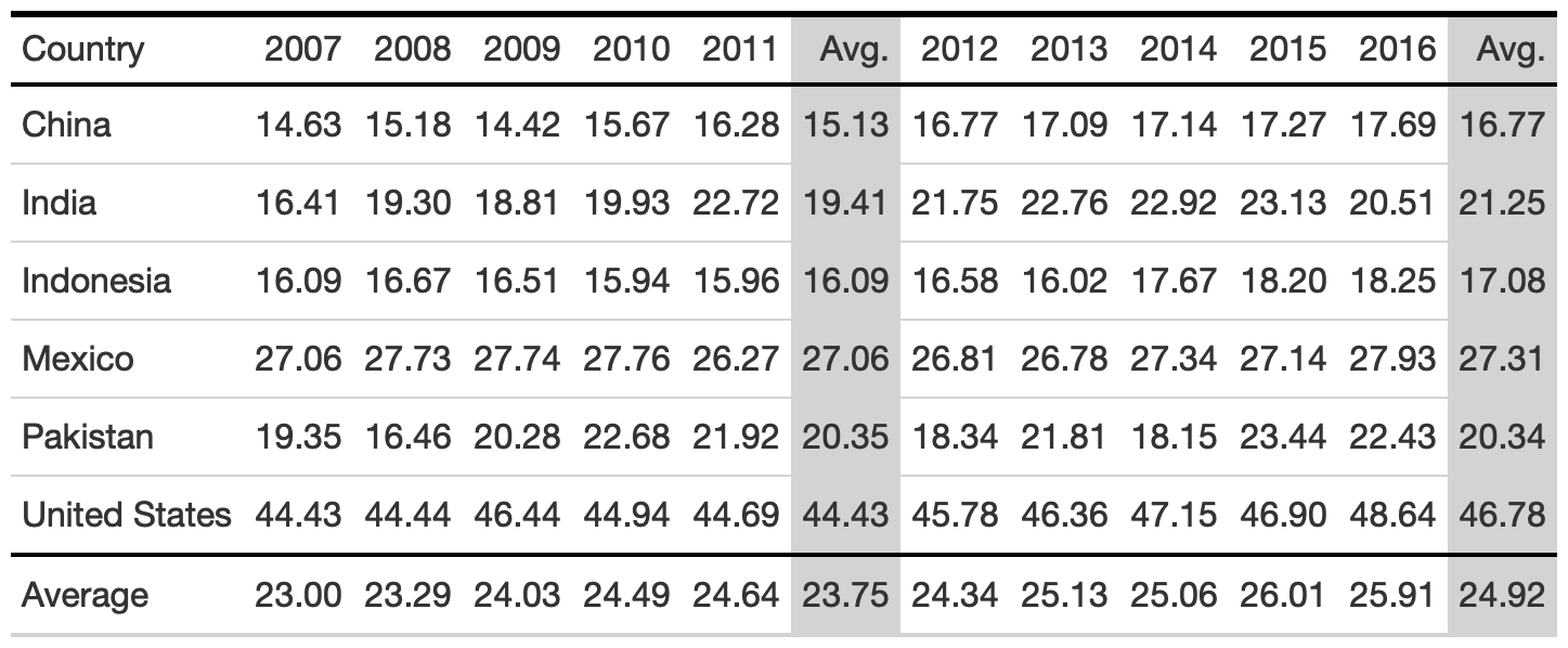
rule2_tab1 <- rule2_data %>% gt( rowname_col = "Country" ) %>% cols_label( avg_07_11 = "Avg.", avg_12_16 = "Avg." ) %>% cols_width( 1 ~ px(125) ) %>% fmt_number( columns = 2:last_col() ) %>% tab_style( style = cell_borders( side = "all", color = "grey", weight = px(1), style = "solid" ), locations = list( cells_body( everything() ), cells_column_labels( everything() ) ) ) %>% grand_summary_rows( columns = 2:last_col(), fns = list( "Average" = ~mean(.) ), formatter = fmt_number )rule2_tab2 <- rule2_data %>% add_row( rule2_data %>% summarize( across(where(is.double), list(Average = mean), .names = "{col}") ) %>% mutate(Country = "Average") ) %>% gt() %>% cols_label( avg_07_11 = "Avg.", avg_12_16 = "Avg." ) %>% fmt_number( columns = 2:last_col() ) %>% tab_style( style = cell_fill( color = "lightgrey" ), locations = list( cells_body( columns = c(avg_07_11, avg_12_16) ), cells_column_labels( columns = c(avg_07_11, avg_12_16) ) ) ) %>% tab_style( style = cell_borders( sides = "top", color = "black", weight = px(2) ), locations = cells_body( columns = everything(), rows = Country == "Average" ) ) %>% tab_style( style = list( cell_text(weight = "bold") ), locations = cells_column_labels(everything()) ) %>% tab_options( column_labels.border.top.color = "black", column_labels.border.top.width = px(3), column_labels.border.bottom.color = "black" )3. Comparison of alignment
Notice that left-alignment or center-alignment of numbers impairs the ability to clearly compare numbers and decimal places. Right-alignment lets you align decimal places and numbers for easy parsing.
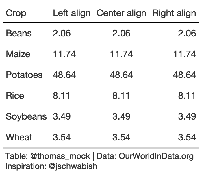
rule3_align <- rule3_data %>% mutate(`Center align` = `2016`, `Right align` = `2016`) %>% rename(`Left align` = 2) %>% gt() %>% tab_style( style = list( cell_text(weight = "bold") ), locations = cells_column_labels(everything()) ) %>% fmt_number( columns = 2:4 ) %>% cols_align(align = "left", columns = 2) %>% cols_align(align = "center", columns = 3) %>% cols_align(align = "right", columns = 4) %>% tab_options( column_labels.border.top.color = "white", column_labels.border.top.width = px(3), column_labels.border.bottom.color = "black", table_body.hlines.color = "white", table.border.bottom.color = "white", table.border.bottom.width = px(3) )3. Addendums to Alignment
When aligning text of equal length (long or very short), center alignment of text can be fine or even preferable. For example, very short text with a long header can be better suited to center-align. Equal length text can be centered without negatively affecting the ability to quickly read.
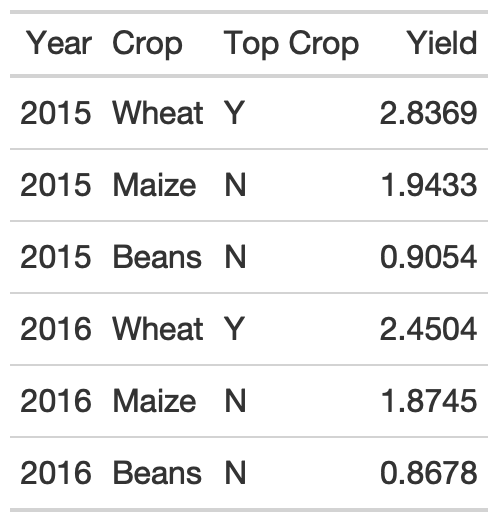
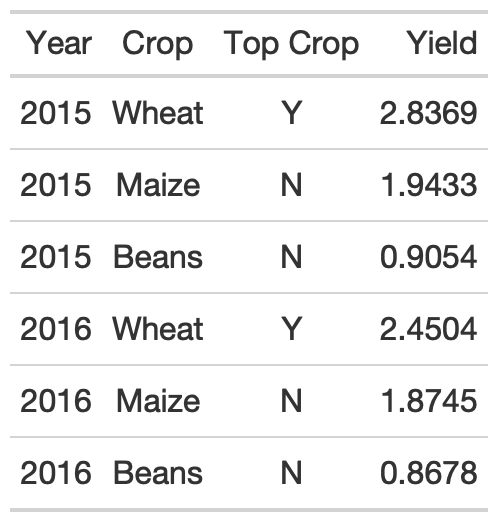
rule3_data_addendum <- yield_data %>% filter( Country %in% c("Africa"), year >= 2015, str_length(crop) == 5 ) %>% group_by(year) %>% mutate( crop = str_to_title(crop), max_yield = max(yield), `Top Crop` = if_else(yield == max_yield, "Y", "N") ) %>% select(Year = year, Crop = crop, `Top Crop`, Yield = yield) %>% ungroup() %>% head() %>% gt()rule3_data_addendum %>% gt() %>% gt::cols_align( align = "center", columns = c(`Top Crop`, Crop) )3. Addendum to Alignment
As an aside, note that pivot_wider() can also improve the function of this table, reducing repetition of both the Crop and Top Crop columns. Again, center alignment helps with the Top Crop column regardless.
rule3_data_addendum %>% pivot_wider( names_from = Year, values_from = Yield ) %>% gt() %>% gt::cols_align( align = "center", columns = c(`Top Crop`) )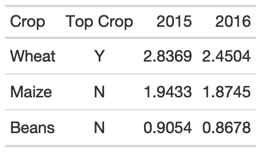
3. Choose fonts carefully
For the fonts below, notice that the Default for gt along with a monospaced font in Fira Mono have nice alignment of decimal places and equally-spaced numbers.
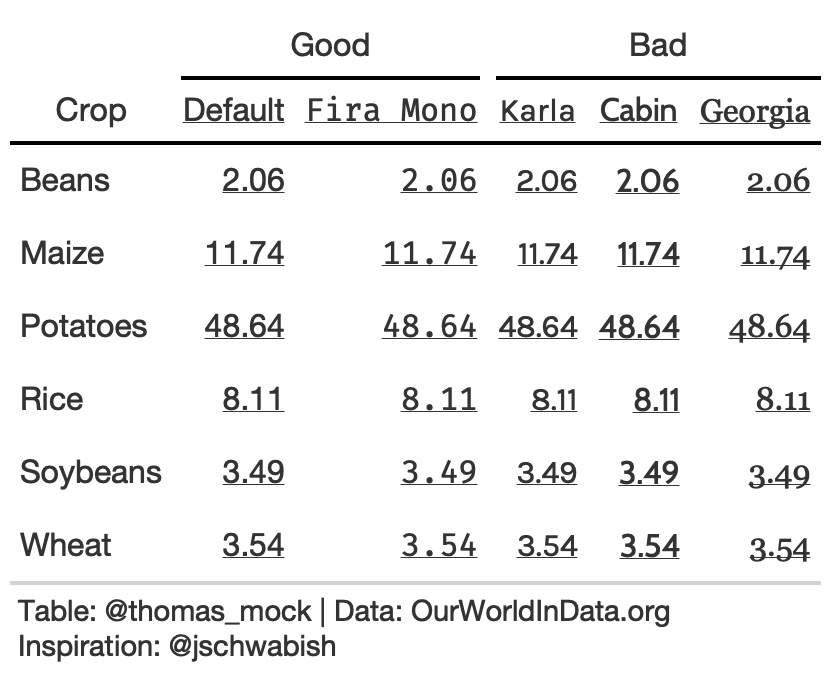
tab_font_fct <- function(data, font, column){ tab_style( data = data, style = list( cell_text(font = font, decorate = "underline") ), locations = list( cells_column_labels( c({{column}}) ), cells_body( c({{column}}) ) ) )}rule3_text <- rule3_data %>% mutate(Karla = `2016`, Cabin = `2016`, Georgia = `2016`, `Fira Mono` = `2016`) %>% rename(Default = 2) %>% gt() %>% tab_font_fct("Default", Default) %>% tab_font_fct("Karla", Karla) %>% tab_font_fct("Cabin", Cabin) %>% tab_font_fct("Georgia", Georgia) %>% tab_font_fct("Fira Mono", `Fira Mono`) %>% fmt_number(columns = 2:6) %>% tab_spanner("Good", c(2,6)) %>% tab_spanner("Bad", 3:5) %>% tab_options( column_labels.border.top.color = "white", column_labels.border.top.width = px(3), column_labels.border.bottom.color = "black", table_body.hlines.color = "white", table.border.bottom.color = "white", table.border.bottom.width = px(3) )Rule 4: Left-align Text and Heads
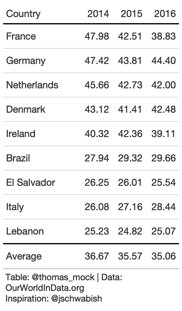
For labels/strings it is typically more appropriate to left-align. This allows your eye to follow both short and long text vertically to scan a table, along with a clear border.
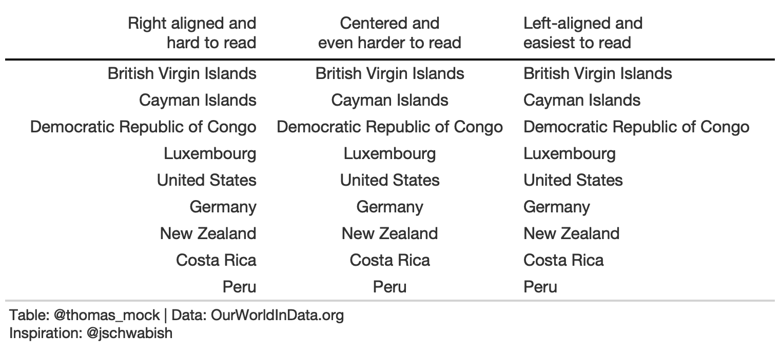
basic_theme <- function(data) { tab_options( data, column_labels.border.top.color = "white", column_labels.border.top.width = px(3), column_labels.border.bottom.color = "black", column_labels.font.weight = "bold", table_body.hlines.color = "white", table.border.bottom.color = "white", table.border.bottom.width = px(3), data_row.padding = px(3) ) }country_names <- c( "British Virgin Islands", "Cayman Islands", "Democratic Republic of Congo", "Luxembourg", "United States","Germany", "New Zealand", "Costa Rica", "Peru")rule4_tab_left <- tibble( right = country_names, center = country_names, left = country_names) %>% gt() %>% cols_align(align = "left", columns = 3) %>% cols_align(align = "center", columns = 2) %>% cols_align(align = "right", columns = 1) %>% cols_width( everything() ~ px(250) ) %>% cols_label( right = md("Right aligned and<br>hard to read"), center = md("Centered and<br>even harder to read"), left = md("Left-aligned and<br>easiest to read") ) %>% basic_theme() %>% tab_source_note(md("**Table**: @thomas_mock | **Data**: OurWorldInData.org<br>**Inspiration**: @jschwabish"))Rule 5: Select the Appropriate Level of Precision
While you can sometimes justify increased decimal places, often 1 or 2 is enough.
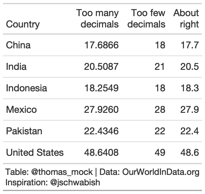
rule5_tab <- yield_data %>% filter( Country %in% country_sel, crop == "potatoes", year %in% c(2016) ) %>% select(Country, yield) %>% mutate(few = yield, right = yield) %>% gt() %>% fmt_number( columns = c(few), decimals = 0 ) %>% fmt_number( columns = c(right), decimals = 1 ) %>% cols_label( yield = md("Too many<br>decimals"), few = md("Too few<br>decimals"), right = md("About<br>right") ) %>% tab_source_note(md("**Table**: @thomas_mock | **Data**: OurWorldInData.org<br>**Inspiration**: @jschwabish"))Rule 6: Guide Your Reader with Space
Think of how you want to guide the reader - vertically or horizontally.
rule6_data <- yield_data %>% filter( Country %in% country_sel, crop == "potatoes", year %in% c(2014:2016) ) %>% filter(crop == "potatoes") %>% pivot_wider( names_from = year, values_from = "yield" ) %>% select(-crop)rule6_tb <- rule6_data %>% arrange(desc(`2014`)) %>% add_row( rule6_data %>% summarize(across(where(is.double), list(Average = mean), .names = "{col}") ) %>% mutate(Country = "Average") ) %>% gt() %>% fmt_number(columns = 2:4, decimals = 2) %>% tab_style( style = list(cell_text(weight = "bold")), locations = cells_column_labels(everything()) ) %>% tab_style( style = cell_borders( sides = "top", color = "black", weight = px(2) ), locations = cells_body( columns = everything(), rows = Country == "Average" ) ) %>% cols_width(c(Country) ~ px(125), 2:4 ~ px(75)) %>% basic_theme()rule6_tb %>% cols_width(c(Country) ~ px(125), 2:4 ~ px(55)) %>% tab_options(data_row.padding = px(10), table_body.hlines.color = "lightgrey")Rule 7: Remove Unit Repetition
rule6_tb %>% fmt_currency( columns = 2:4 )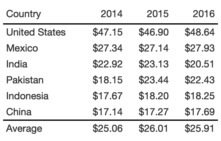
rule6_tb %>% fmt_currency( columns = 2:4, rows = 1 )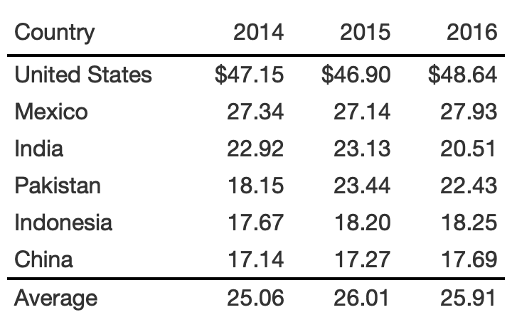
rule6_tb %>% cols_label( `2014` = "2014 ($)", `2015` = "2015 ($)", `2016` = "2016 ($)" ) %>% cols_width( 2:4 ~ px(100) )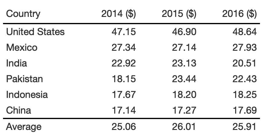
rule6_tb %>% tab_spanner( label = md("**Value of Yield ($)**"), columns = 2:4 )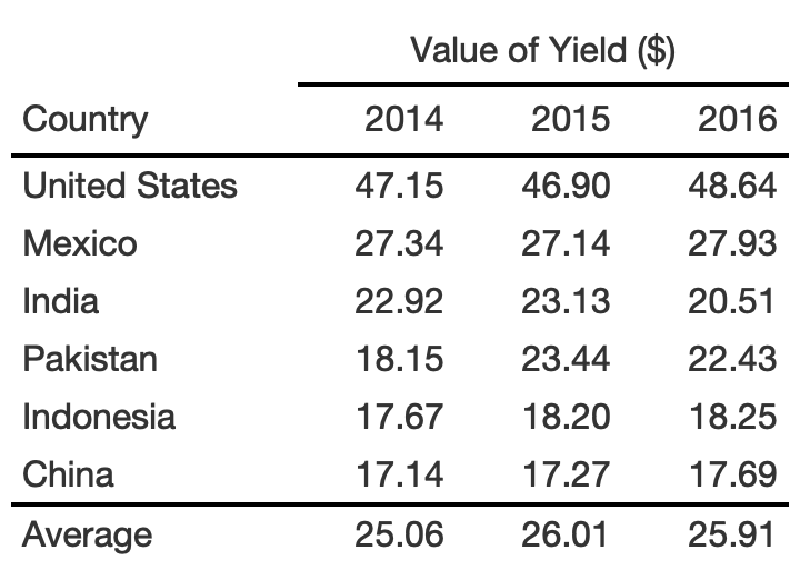
rule6_tb %>% tab_footnote( footnote = md("**Value of Yield ($)**"), locations = cells_column_labels(2:4) )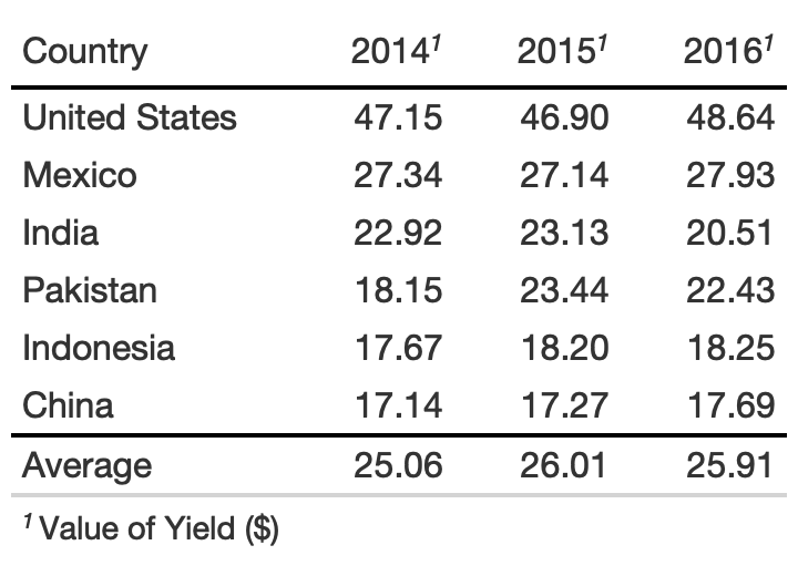
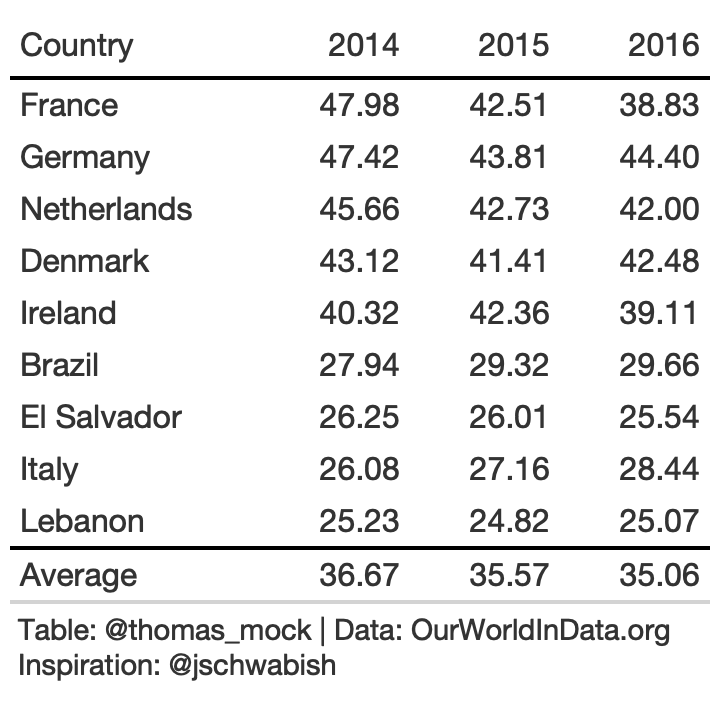
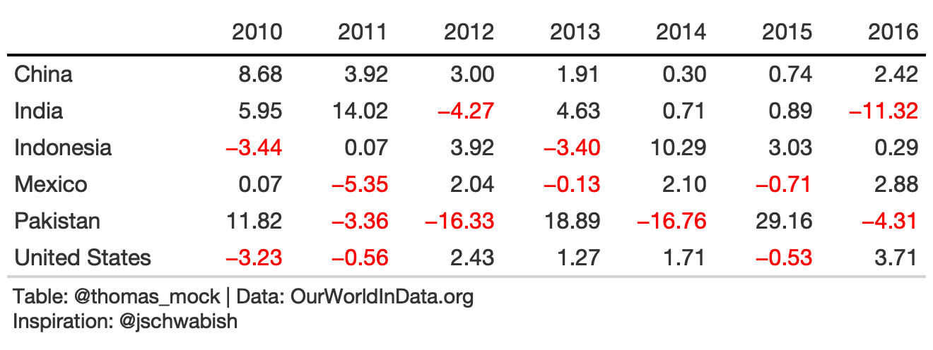
Rule 8: Highlight Outliers
With large data tables, it can be useful to take a page from our Data Viz and highlight outliers with color or shape.

rule8_data <- yield_data %>% filter( Country %in% country_sel, crop == "potatoes", year %in% 2009:2017 ) %>% group_by(Country) %>% mutate(pct_change = (yield/lag(yield)-1)*100) %>% ungroup() %>% filter(between(year, 2010, 2016)) %>% select(Country, year, pct_change) %>% pivot_wider(names_from = year, values_from = pct_change)rule8_tb <- rule8_data %>% gt() %>% fmt_number(2:last_col()) %>% cols_label( Country = "" ) %>% tab_style( style = list( cell_text(weight = "bold") ), locations = cells_column_labels(everything()) ) %>% basic_theme() %>% cols_width(c(Country) ~ px(125), 2:last_col() ~ px(75))Rule 8: Highlight Outliers
With a bit of color added we can clearly focus on the outliers.
rule8_data <- yield_data %>% filter( Country %in% country_sel, crop == "potatoes", year %in% 2009:2017 ) %>% group_by(Country) %>% mutate(pct_change = (yield/lag(yield)-1)*100) %>% ungroup() %>% filter(between(year, 2010, 2016)) %>% select(Country, year, pct_change) %>% pivot_wider(names_from = year, values_from = pct_change)rule8_color <- rule8_tb %>% tab_style( style = cell_text(color = "red"), locations = list( body_fct(2, `2010`), body_fct(3, `2011`), body_fct(4, `2012`), body_fct(5, `2013`), body_fct(6, `2014`), body_fct(7, `2015`), body_fct(8, `2016`) ) )body_fct <- function(col, row){ cells_body( columns = col, rows = {{row}} < 0 )}Rule 8: Highlight Outliers
We can really pull the focus with background fill of each cell outlier.
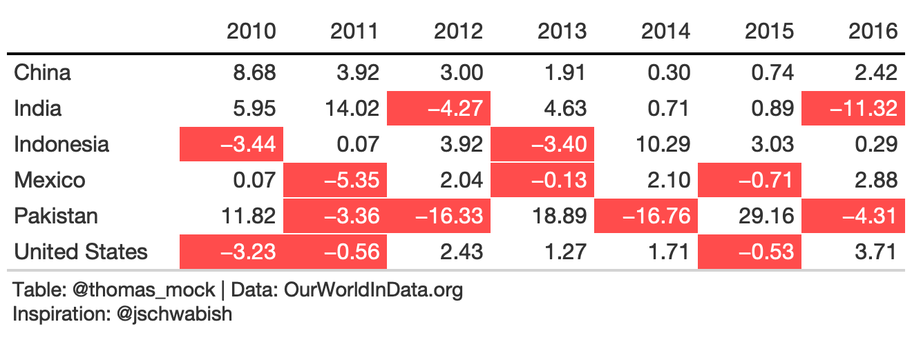
rule8_fill <- rule8_tb %>% tab_style( style = list( cell_fill(color = scales::alpha("red", 0.7)), cell_text(color = "white", weight = "bold") ), locations = list( body_fct(2, `2010`), body_fct(3, `2011`), body_fct(4, `2012`), body_fct(5, `2013`), body_fct(6, `2014`), body_fct(7, `2015`), body_fct(8, `2016`) ) ) %>% tab_source_note(md("**Table**: @thomas_mock | **Data**: OurWorldInData.org<br>**Inspiration**: @jschwabish"))9. Bad Example
rule9_bad <- rule9_data %>% gt() %>% fmt_number( columns = c(`2015`, `2016`, pct_change) ) %>% tab_spanner( columns = c(`2015`, `2016`), label = md("**Yield in<br>Tonnes/Hectare**") ) %>% cols_width( c(crop) ~ px(125), c(`2015`, `2016`, pct_change) ~ 100 )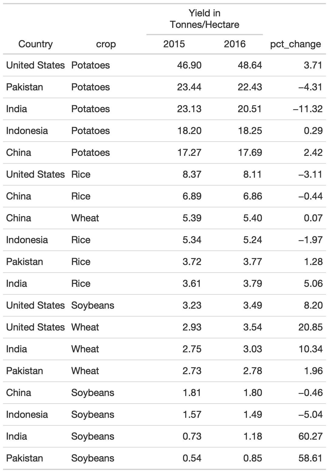
9. gt native grouping
gt provides row group levels that we can use to separate by Country.
rule9_grp <- rule9_data %>% gt(groupname_col = "Country") %>% tab_stubhead("label") %>% tab_options( table.width = px(300) ) %>% cols_label( crop = "", pct_change = md("Percent<br>Change") ) %>% fmt_number( columns = c(`2015`, `2016`, pct_change) ) %>% tab_style( style = cell_text(color = "black", weight = "bold"), locations = list( cells_row_groups(), cells_column_labels(everything()) ) ) %>% tab_spanner( columns = c(`2015`, `2016`), label = md("**Yield in Tonnes/Hectare**") ) %>% cols_width( c(crop) ~ px(125), c(`2015`, `2016`, pct_change) ~ 100 ) %>% basic_theme()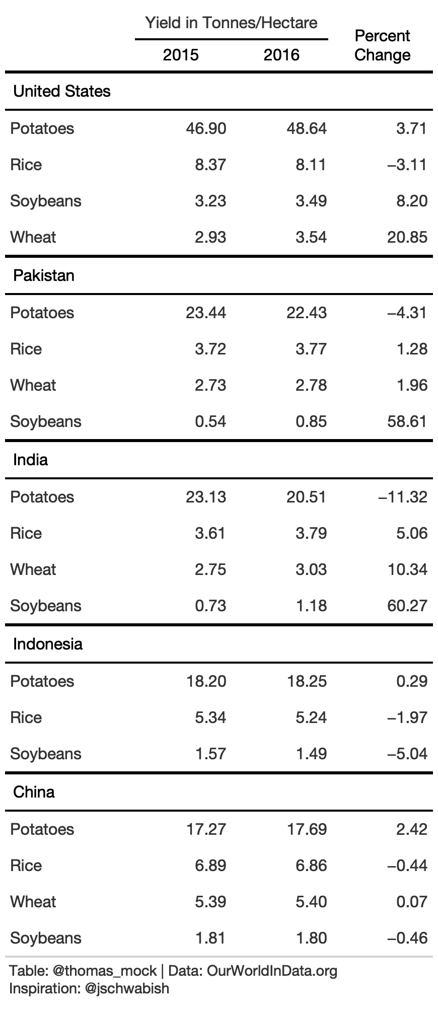
9. Remove duplicate data
Alternatively, we can remove some observations to create more white space.
rule9_dup <- rule9_data %>% arrange(Country) %>% gt() %>% cols_label( Country = "", crop = "Crop", pct_change = md("Percent<br>Change") ) %>% tab_spanner(columns = c(`2015`, `2016`), label = md("**Yield in Tonnes/Hectare**")) %>% fmt_number( columns = c(`2015`, `2016`, pct_change) ) %>% text_transform( locations = cells_body( columns = c(Country), rows = crop != "Potatoes" ), fn = function(x){ paste0("") } ) %>% tab_style( style = cell_text(color = "black", weight = "bold"), locations = list( cells_row_groups(), cells_column_labels(everything()) ) ) %>% cols_width( c(Country, crop) ~ px(125), c(`2015`, `2016`, pct_change) ~ 100 ) %>% basic_theme()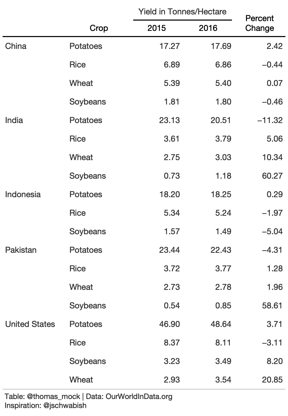
10. Sparklines - Trends across Time
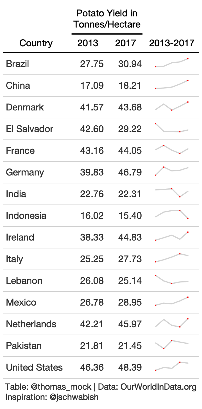
small_yield <- yield_data %>% filter( year %in% c(2013:2017), crop == "potatoes", Country %in% country_sel ) split_yield <- split(small_yield$yield, small_yield$Country)rule10_spark <- rule10_data %>% mutate(spark = map(split_yield, kableExtra::spec_plot), spark = map(spark, "svg_text"), spark = map(spark, ~html(as.character(.x)))) %>% select(-crop) %>% gt() %>% cols_label( spark = "2013-2017" ) %>% fmt_number(2:3) %>% tab_spanner( label = md("Potato Yield in<br>Tonnes/Hectare"), columns = c(2,3) ) %>% tab_style( style = cell_text(color = "black", weight = "bold"), locations = list( cells_column_spanners(everything()), cells_column_labels(everything()) ) ) %>% tab_options( row_group.border.top.width = px(3), row_group.border.top.color = "black", row_group.border.bottom.color = "black", table.border.top.color = "white", table.border.top.width = px(3), table.border.bottom.color = "white", table.border.bottom.width = px(3), column_labels.border.bottom.color = "black", column_labels.border.bottom.width = px(2), )10. Barplot
For this example we can use barplots to indicate the average across the 5 years. Many thanks to the formattable author Renkun Kun and others like rtjohnson12 who have shown examples about how to build up a bar chart with HTML! Thanks also to Christophe Dervieux for a great example of gt + custom HTML on RStudio Community.

# Example of using glue to just paste the value into pre-created HTML block# Example adapted from rtjohnson12 at: # https://github.com/renkun-ken/formattable/issues/79#issuecomment-573165954bar_chart <- function(value, color = "red", display_value = NULL){ # Choose to display percent of total if (is.null(display_value)) { display_value <- " " } else { display_value <- display_value } # paste color and value into the html string glue::glue("<span style=\"display: inline-block; direction: ltr; border-radius: 4px; padding-right: 2px; background-color: {color}; color: {color}; width: {value}%\"> {display_value} </span>")}# create a color palette w/ paletteercol_pal <- function(value){ # set high and low domain_range <- range(c(rule10_data$`2013`, rule10_data$`2017`)) # create the color based of domain scales::col_numeric( paletteer::paletteer_d("ggsci::blue_material") %>% as.character(), domain = c(min(value), max(value)) )(value)}bar_yields <- yield_data %>% filter( year %in% c(2013:2017), crop == "potatoes", Country %in% c( country_sel, "Germany", "Brazil", "Ireland", "Lebanon", "Italy", "Netherlands", "France", "Denmark", "El Salvador", "Denmark" ) ) %>% pivot_wider(names_from = year, values_from = yield) %>% select(-crop) %>% rowwise() %>% mutate( mean = mean(c(`2013`, `2014`, `2015`, `2016`, `2017`)) ) %>% ungroup() %>% select(Country, `2013`, `2017`, `mean`) %>% mutate( bar = round(mean/max(mean)*100, digits = 2), color = col_pal(bar), bar_chart = bar_chart(bar, color = color), bar_chart = map(bar_chart, ~gt::html(as.character(.x)))) %>% select(-bar, -color)rule10_bar <- bar_yields %>% gt() %>% cols_width( c(bar_chart) ~ px(110), c(mean, `2013`, `2017`) ~ px(90) ) %>% cols_label( mean = md("Average<br>2013-17"), bar_chart = "" ) %>% cols_align( align = "right", columns = 2:4 ) %>% cols_align( align = "left", columns = c(bar_chart) ) %>% fmt_number(2:4) %>% tab_style( style = cell_text(color = "black", weight = "bold"), locations = list( cells_column_labels(everything()) ) ) %>% basic_theme() %>% tab_options(data_row.padding = px(8)) %>% tab_footnote(footnote = "Potato Yield in Tonnes per Hectare", locations = cells_column_labels( columns =2:4 ))10. Heatmap
Lastly, you can add colors across the entire plot itself to show trends across the data over time and across country.
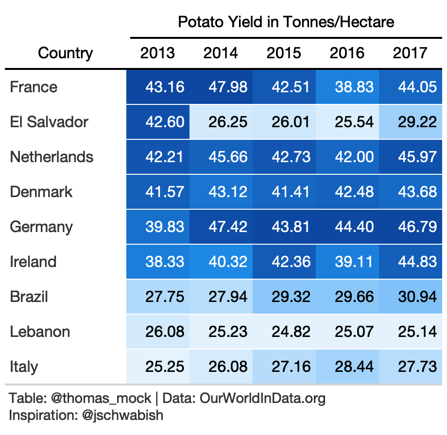
rule10_wide <- yield_data %>% filter( year %in% c(2013:2017), crop == "potatoes", Country %in% c( country_sel, "Germany", "Brazil", "Ireland", "Lebanon", "Italy", "Netherlands", "France", "Denmark", "El Salvador", "Denmark" ) ) %>% pivot_wider(names_from = year, values_from = yield) %>% arrange(desc(`2013`)) %>% select(-crop)rule10_heat <- rule10_wide %>% gt() %>% data_color( columns = 2:6, colors = scales::col_numeric( palette = paletteer::paletteer_d( palette = "ggsci::blue_material" ) %>% as.character(), domain = NULL ) ) %>% fmt_number(2:6) %>% tab_spanner( label = "Potato Yield in Tonnes/Hectare", columns = c(2:6) ) %>% tab_style( style = cell_text(color = "black", weight = "bold"), locations = list( cells_column_spanners(everything()), cells_column_labels(everything()) ) ) %>% cols_width( 1 ~ px(125), 2:6 ~ px(65) ) %>% basic_theme()10. Percent Change
Ok I lied! One more example, with color for a numeric column.
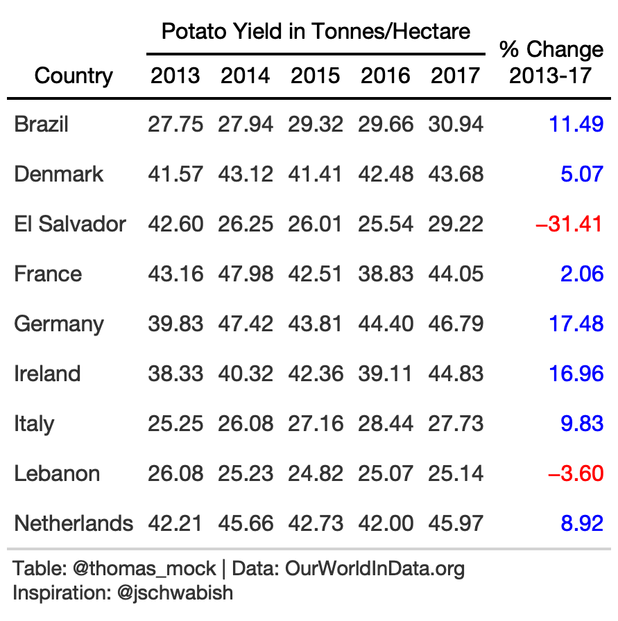
rule10_wide <- yield_data %>% filter( year %in% c(2013:2017), crop == "potatoes", Country %in% c( country_sel, "Germany", "Brazil", "Ireland", "Lebanon", "Italy", "Netherlands", "France", "Denmark", "El Salvador", "Denmark" ) ) %>% pivot_wider(names_from = year, values_from = yield) %>% arrange(Country) %>% select(-crop) %>% mutate(pct_change = (`2017`/`2013`-1)*100)rule10_pct <- rule10_wide %>% gt()%>% fmt_number(2:7) %>% cols_label( pct_change = md("% Change<br>2013-17") ) %>% tab_style( style = list( cell_text(color = "red") ), locations = cells_body( columns = c(pct_change), rows = pct_change <= 0 ) ) %>% tab_style( style = list( cell_text(color = "blue") ), locations = cells_body( columns = c(pct_change), rows = pct_change > 0 ) ) %>% tab_spanner( label = "Potato Yield in Tonnes/Hectare", columns = c(2:6) ) %>% tab_style( style = cell_text(color = "black", weight = "bold"), locations = list( cells_column_spanners(everything()), cells_column_labels(everything()) ) ) %>% basic_theme() %>% tab_options(data_row.padding = px(8))